The Pad at Banilad
Embracing a new culture of co-living
Challenge
Cebu Landmasters Inc. approached us to design an identity for the newest co-living space development that is purposely built to provide young professionals with a home to belong to and a community that embraces them like family.
Client
Cebu Landmasters, Inc.
Scope
Branding

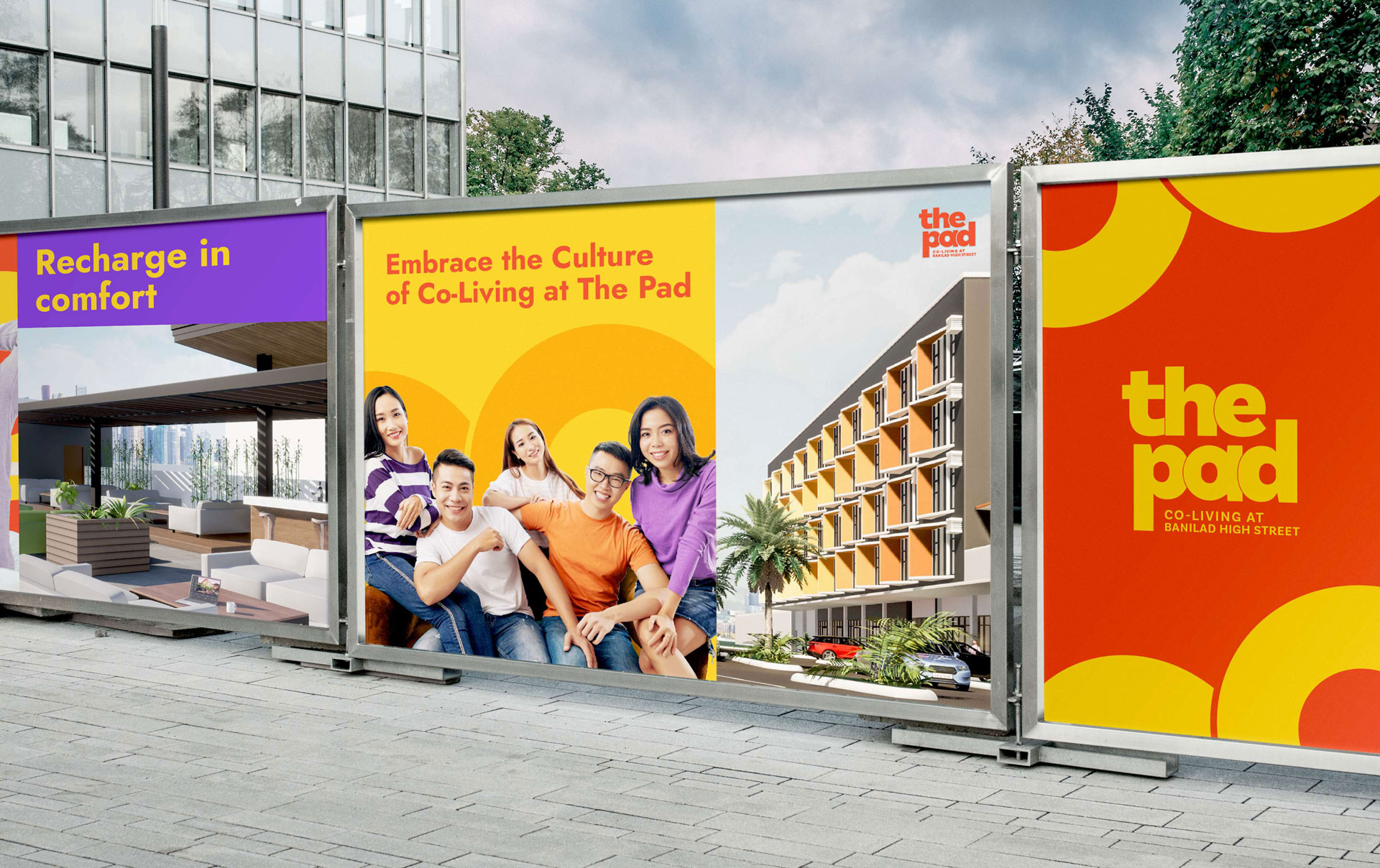
Embrace the culture of co-living
Blurring the lines between interconnectedness and independence, this tagline embodies the new culture of co-living that is on the rise in The Pad.
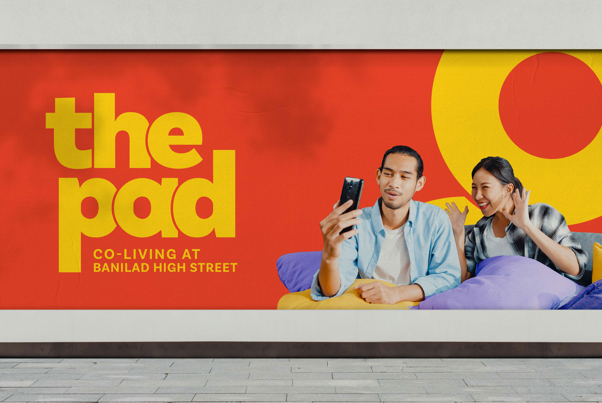
Empowering the bold ambitions of young professionals
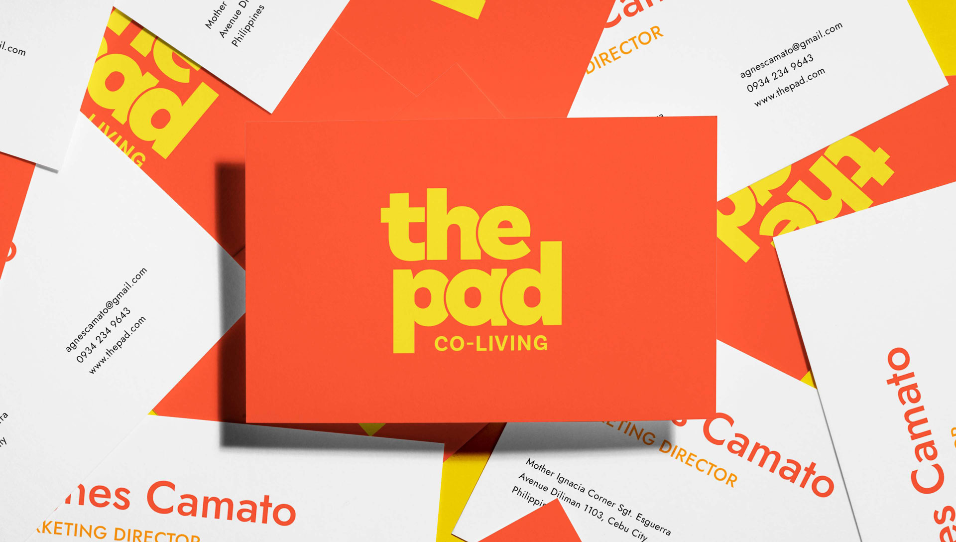
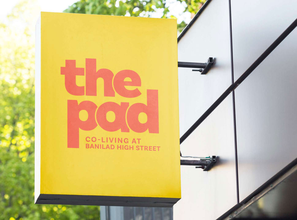
Anchoring on the values of harmony and camaraderie, this logo radiates a bold and fun vibe that fosters the collective idea of community, conversation, and collaboration.


Reflecting the dynamic lifestyle of the current generation
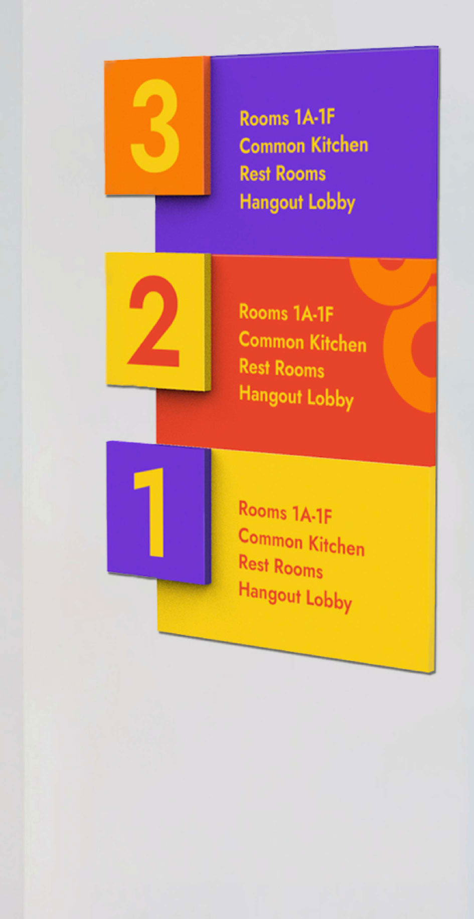
We imbued the color palette with vibrant hues conveying vivid warmth, excitement, and enthusiasm. We used orange as the primary color, while purple shades were added to provide a bold and striking complement to orange’s youthful passion.
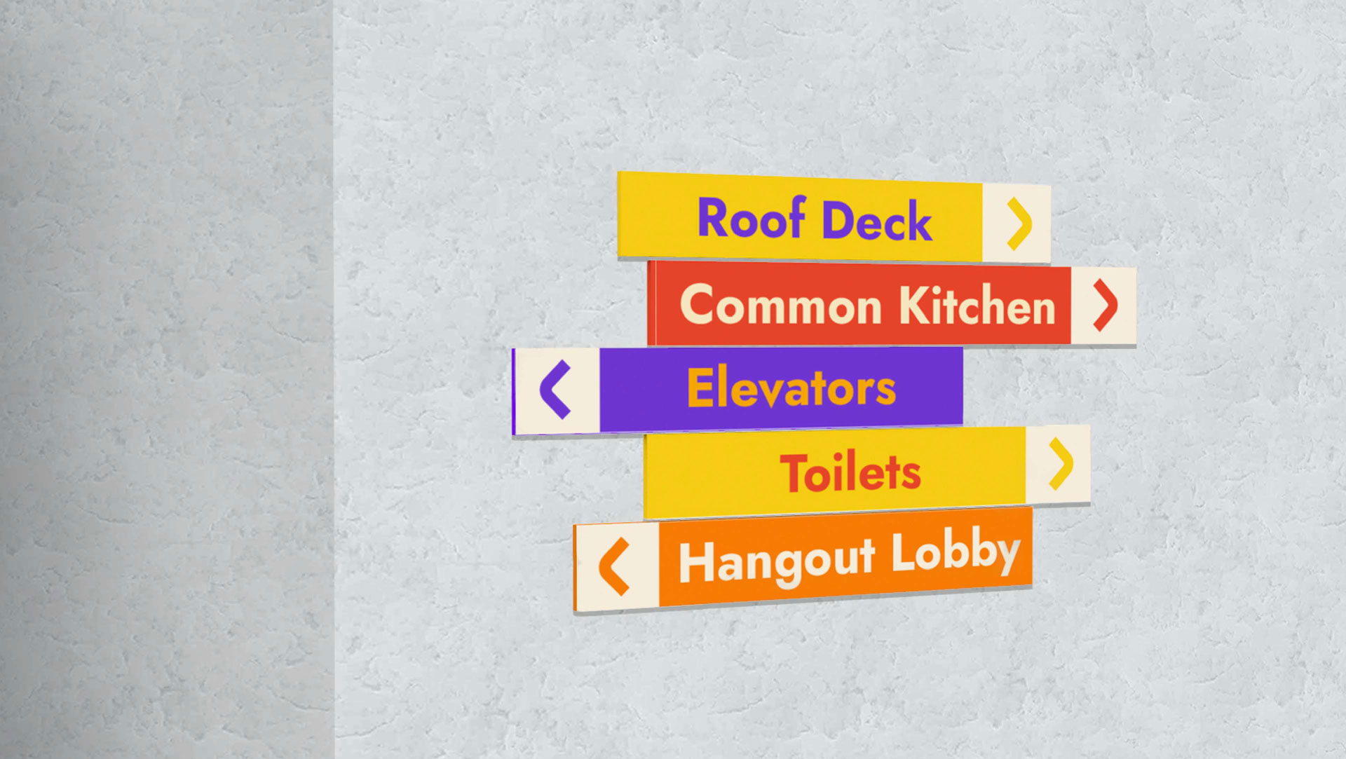
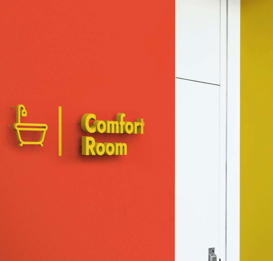
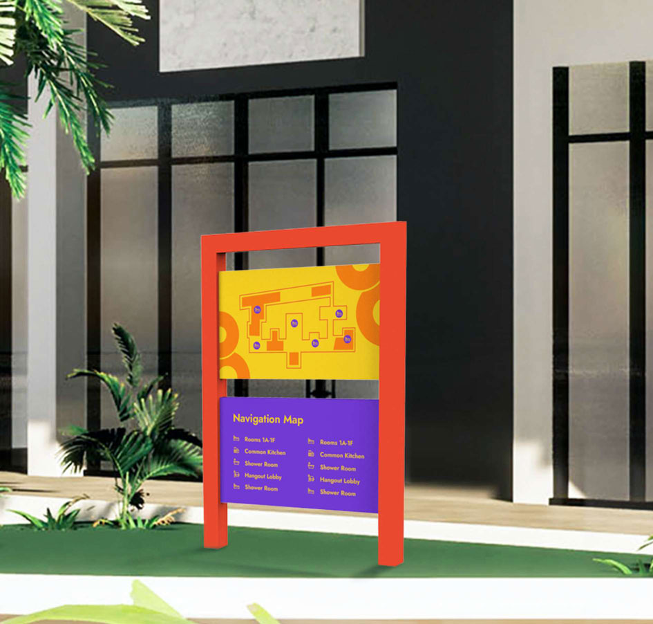
Instilled with the social vibe of an inspiring community
Jost Heavy is a modern sans serif typeface with a friendly and cheerful personality that reflects the promising energy and optimism of the youth. For good contrast, Jost Heavy is to be used for heading and titles, while we use Proxima Nova for body copy.

Taking a break from the grind of hustle culture
Our imagery expresses the passion and confidence of young, self-driven professionals towards their bold ambitions. We made the photos look bright and candid, with ample lighting to showcase the genuineness of social interactions and people in their element.


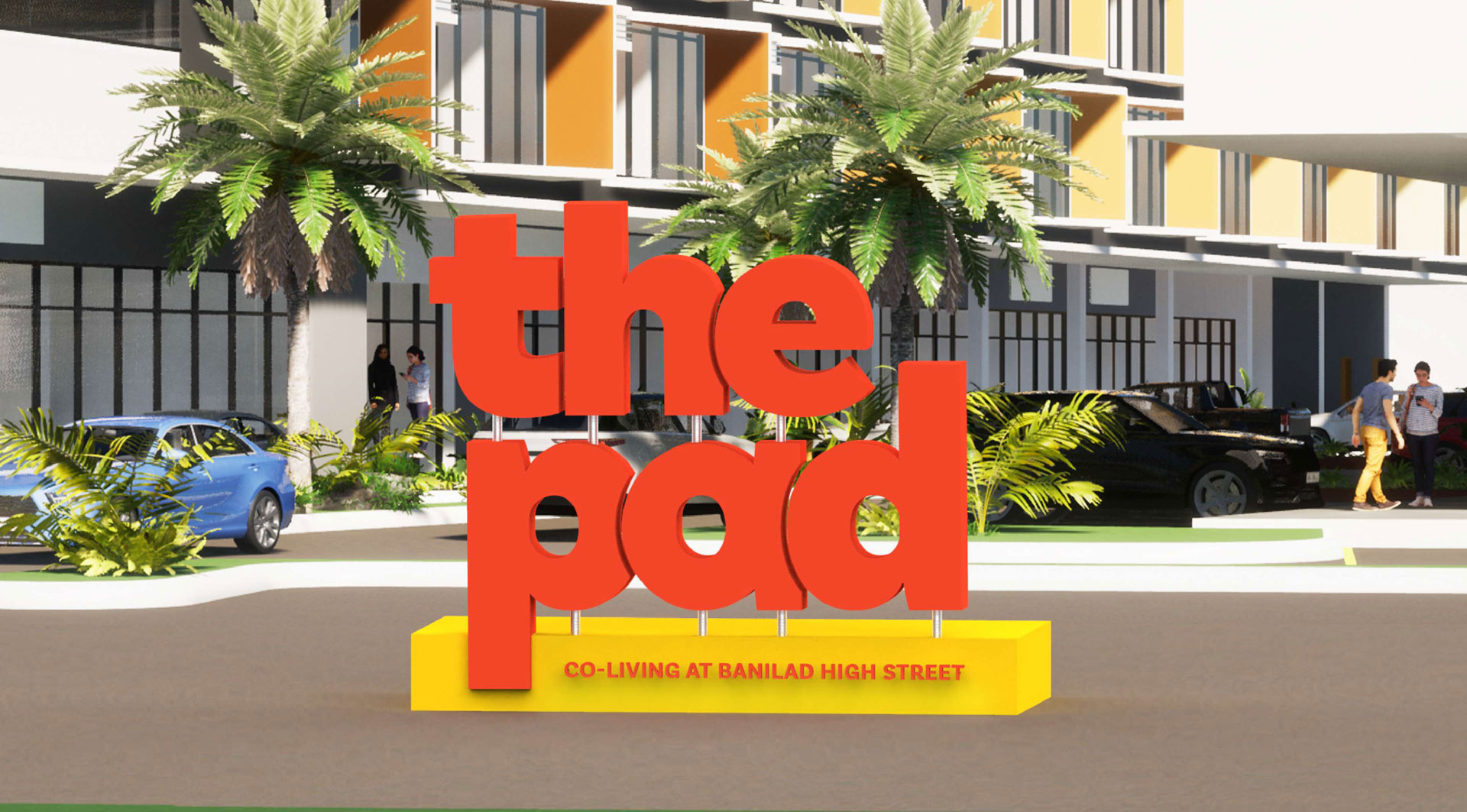
Recharging in the comfort of flexible shared spaces
Introducing a bold sense of community and independence, we came up with an identity that brings a new culture of co-living where young professionals can retreat when they need respite, or hang out and work together with like-minded people.

