Mr. Kimbob
Mixing up the colorful flavors of Korean cuisine
Challenge
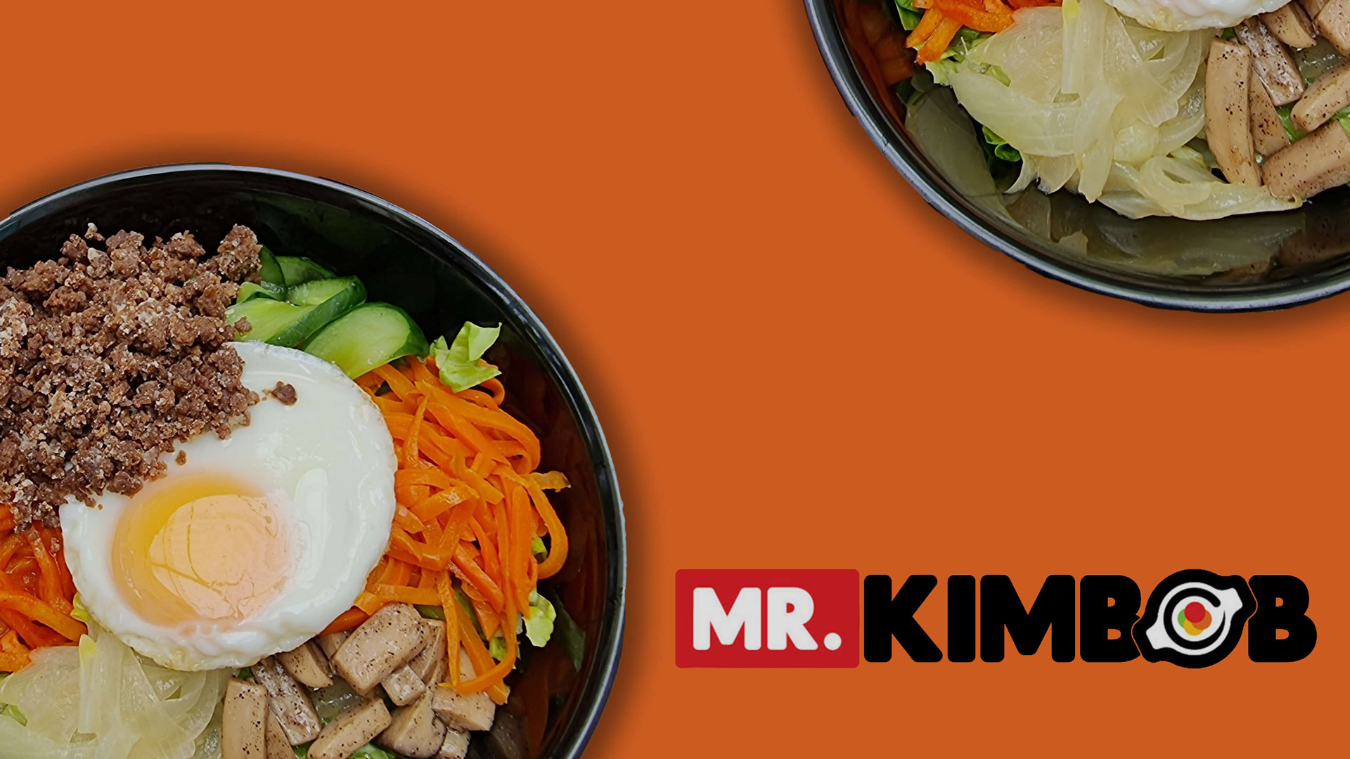
Looking to add more meaningful flavors to the mix, Mr. Kimbob challenged us to give the brand a fresh new taste with an identity better rooted in its rich history.
Client
Mr. Kimbob
Scope
Branding
Crafting a fresh and healthy connection
With the symbolic sizzling plate combined with a custom typeface for the wordmark, we put together the essential elements of Mr. Kimbob to its logo. We humanized it with a bolder and more innovative look as it grows in popularity and relevance.


Savoring the sumptuous feast of colors
The primary colors of red and black are complemented with an assortment of vibrant colors representing Mr. Kimbob’s freshest and healthiest ingredients. The colors were made to be vibrant to stimulate the appetite and entice the taste buds.
Infusing a deliciously irresistible character
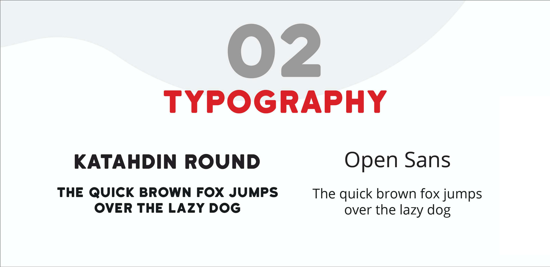
We used a rounded font to depict Mr. Kimbob’s cheerful and appealing personality. Katahdin Round makes a delightful accompaniment to their food’s indulgent features and wholesome dining experience.
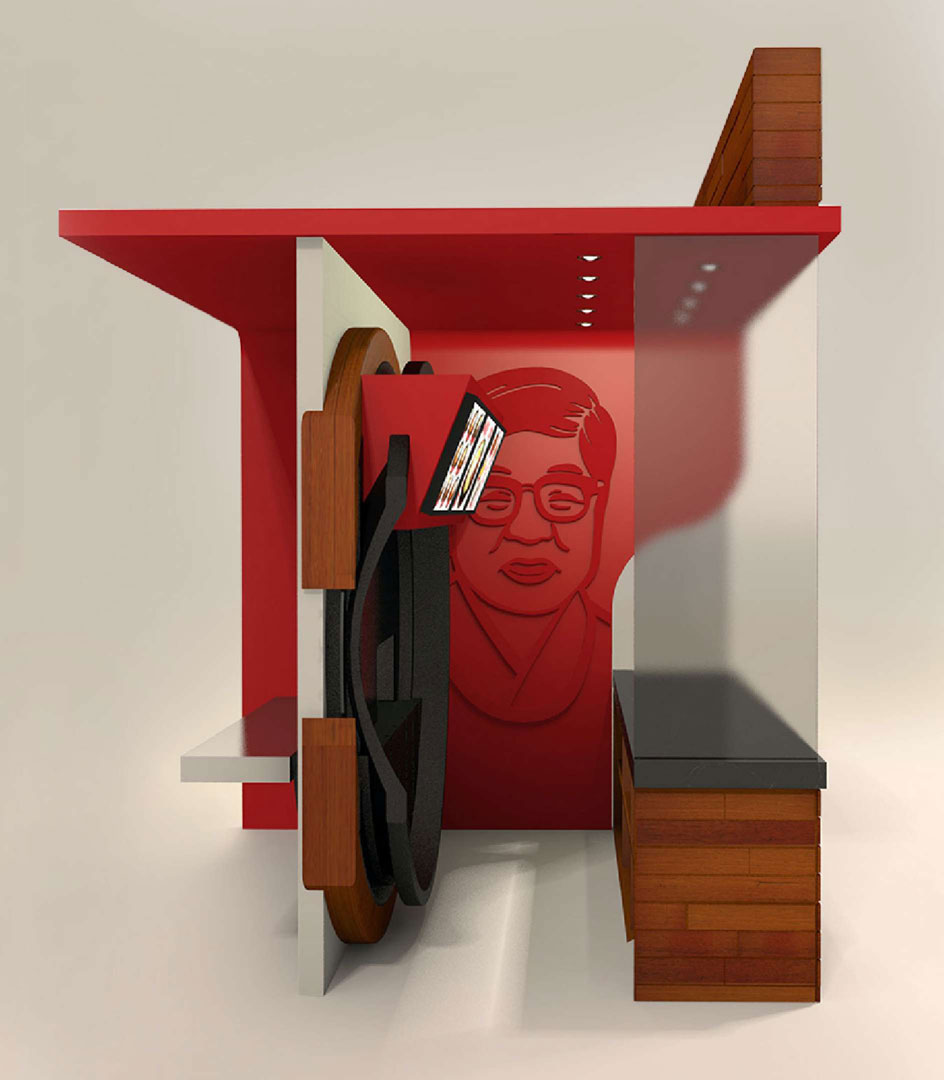
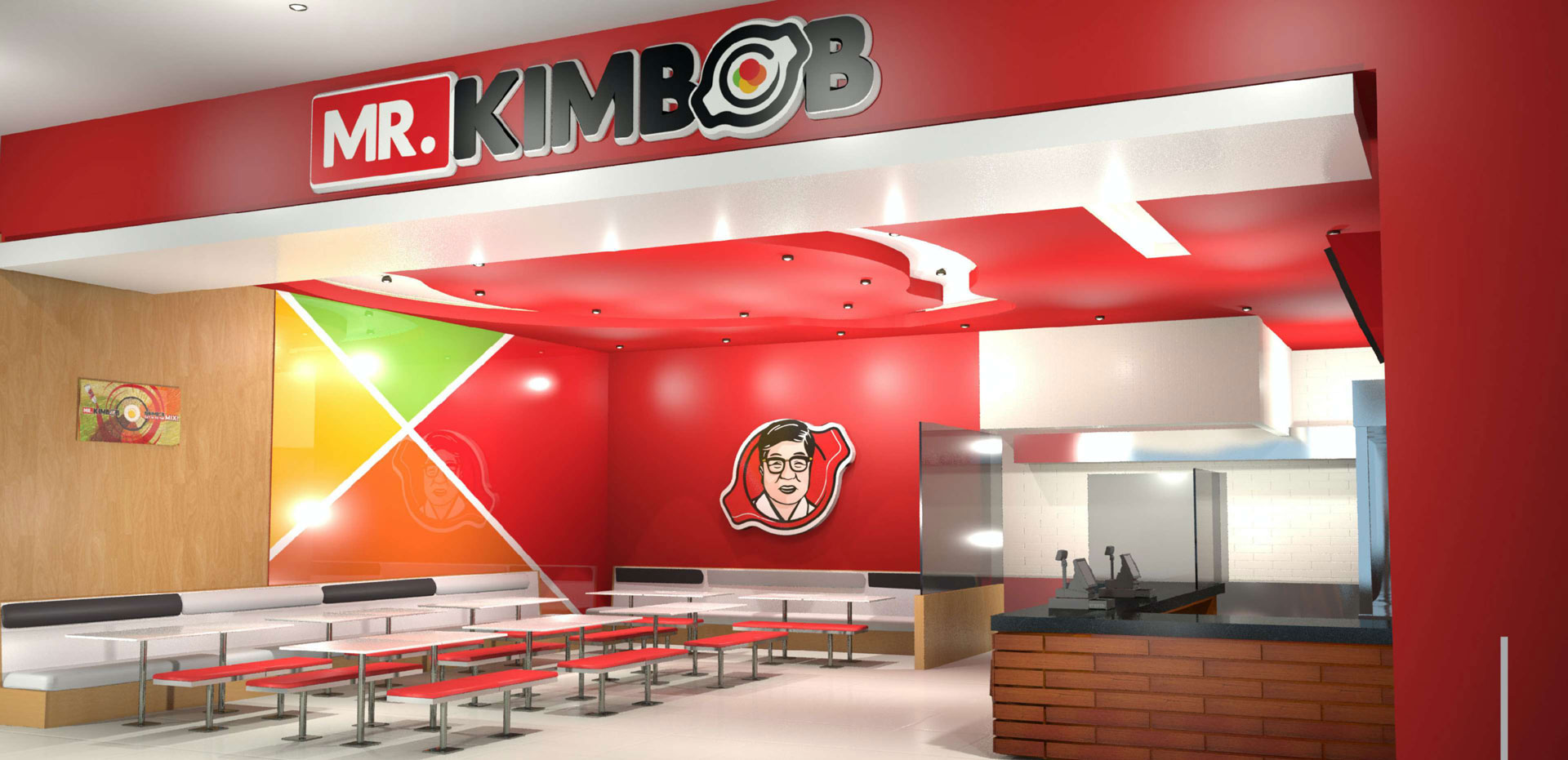
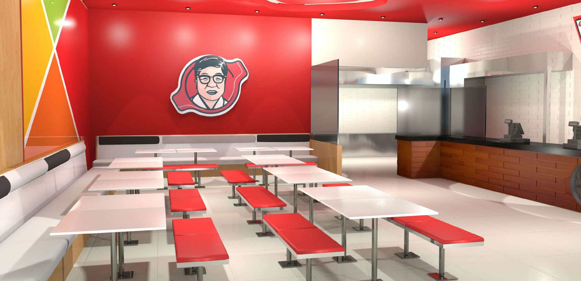
Creating warm and welcoming spaces
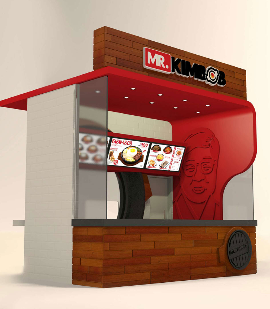
Like the warmth in every plate of Mr. Kimbob’s tasty dishes, we designed the brand’s kiosks and stores to emanate the complete delectable experience for every customer. Decorated with the brand’s bright and refreshing colors, each store and kiosk is friendly and appealing.

Spicing it up with a pinch of innovation
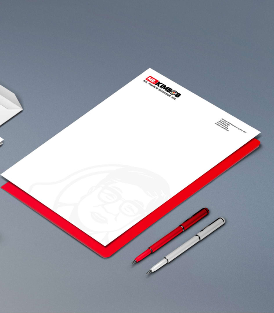
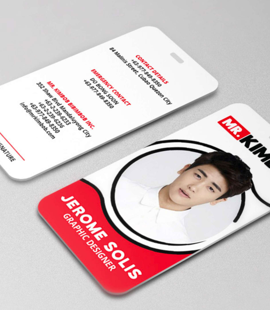
We transformed Mr. Kimbob’s brand collaterals with the spiced-up visual identity. We designed innovative pieces to carry the whole brand experience and showcase Mr. Kimbob’s rich history along with its delicious meals.
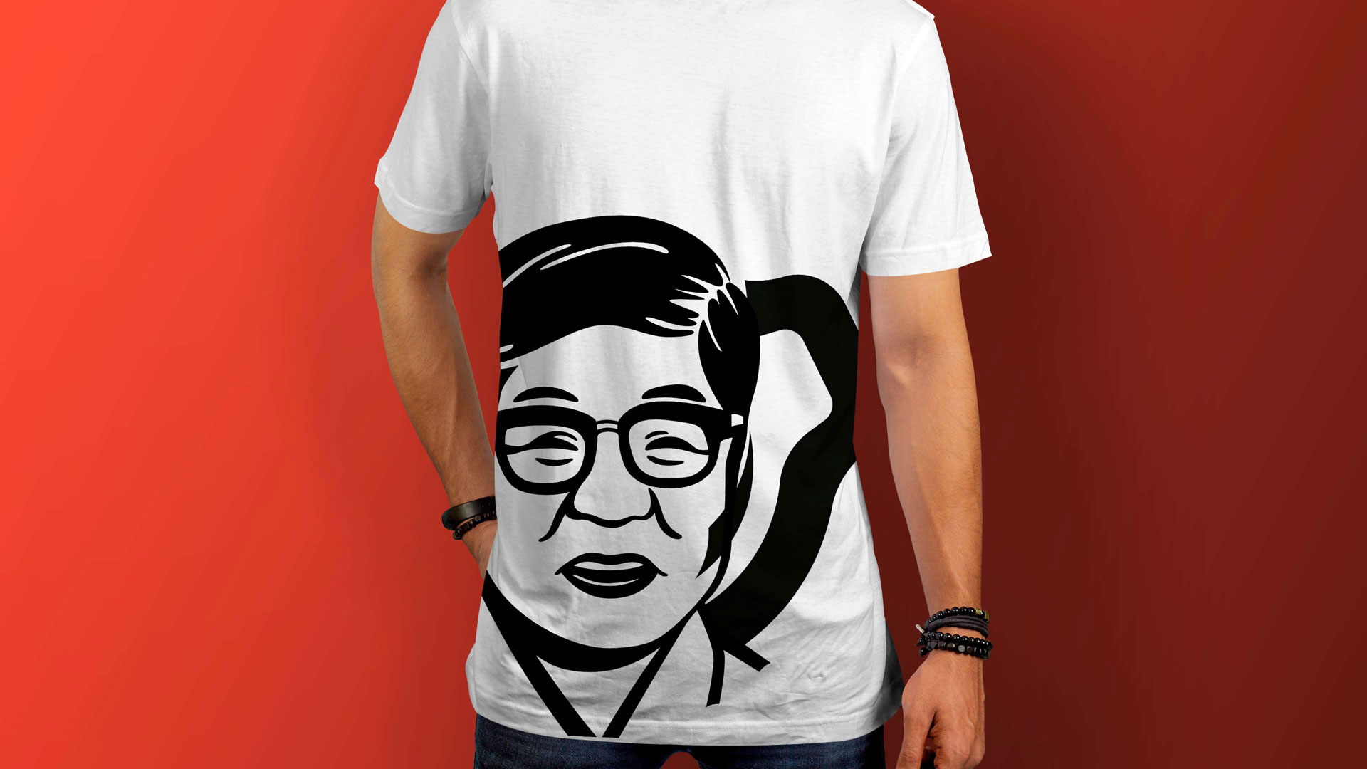
Enriching flavors with meaningful stories
To capture the essence of Mr. Kimbob’s personality and become more rooted in its rich history, we developed a brand new identity enriched with the assortment of its delightful dishes, symbolic elements, and heartwarming stories.


