IVO
Introducing a wellness innovation to Filipino homes
Challenge
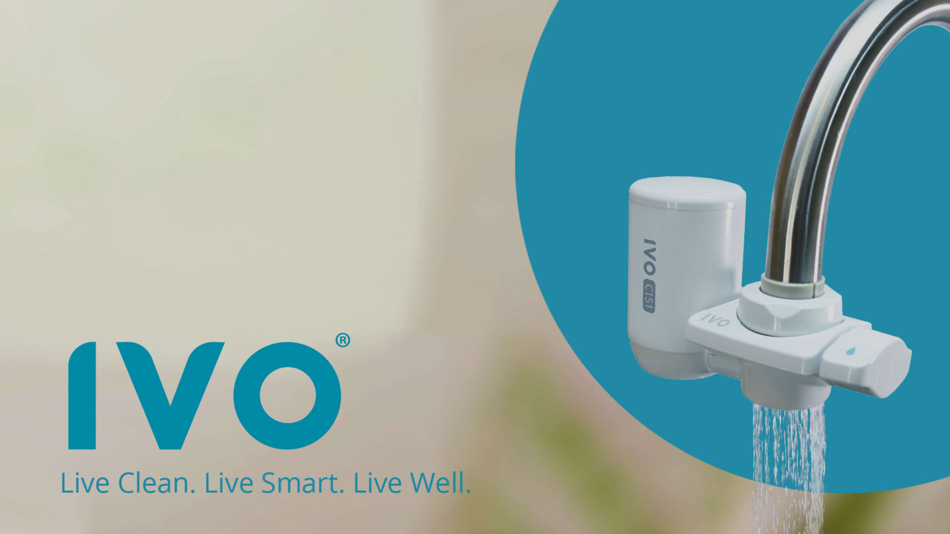
To introduce a Japanese water filtration system brand to Filipinos, Torayvino challenged us to adapt it to the Philippine market under a new brand name. Brought by a partner local distributor in the Philippines, we reimagined Japan’s #1 purifier brand to make it a staple in Filipino households.
Client
IVO Philippines
Scope
Branding
Tracing the roots of an identity
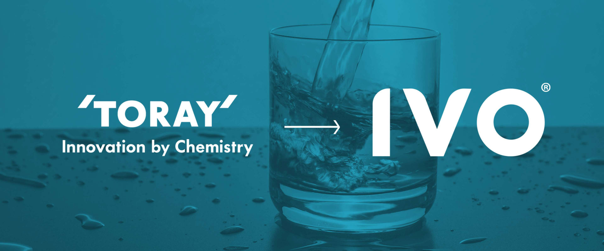
The core idea for IVO comes from its predecessor, Torayvino. We adapted the Torayvino name and reformed it to better suit a household water filtration system brand, and IVO was the result. IVO invokes the image of innovation and technology-driven products while remaining consumer and family-friendly.
Merging innovation and accessibility
IVO’s logo is a clean, rounded watermark complemented by significant sharp edges. This combination creates a balance for the brand’s identity, with the round sections communicating approachability and the sharp edges signifying innovation.
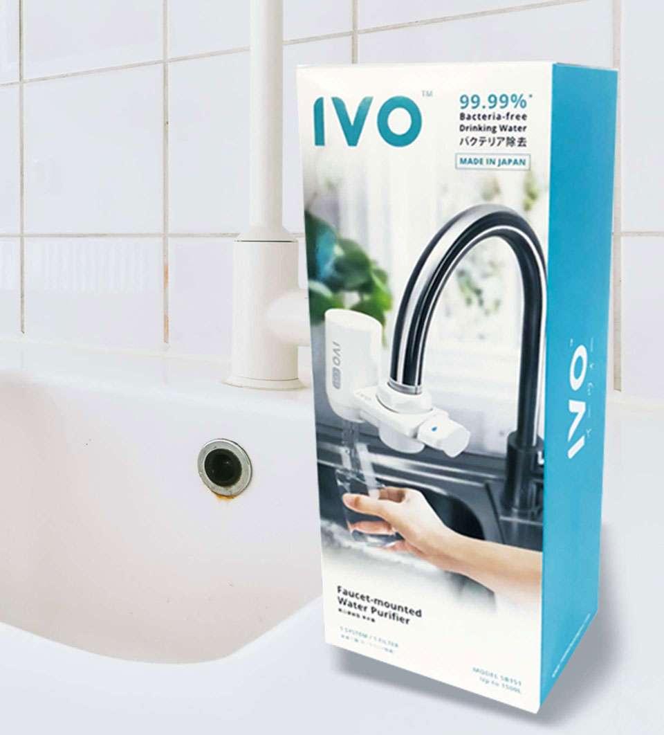
Live clean. Live smart. Live well.
IVO goes beyond merely creating potable water—IVO provides wellness for households. The brand assures that anyone can live a smart and comfortable life through innovative technology.


Reflecting the brand’s purpose
Calm and clean, IVO’s color palette is a clear representation of the brand and its purpose. Eastern blue signifies the color of water, cleanliness, loyalty, intelligence, and care. Meanwhile, space grey serves as a neutralizer for the varying hues of blue.
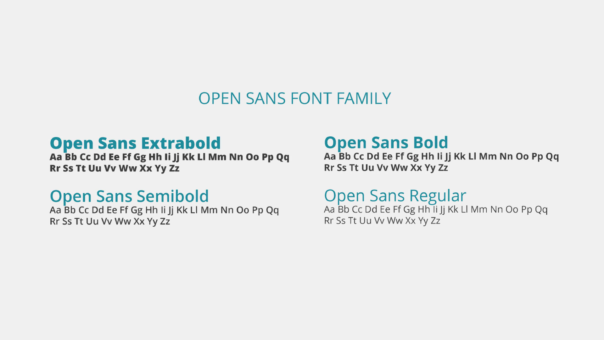
Reflecting the brand’s purpose
The upright stress, open forms, and Open Sans’ neutral yet friendly appearance allow the brand to deliver a clear and easily understood message. It is neat, pleasant, and optimized for reading both in print and digital.
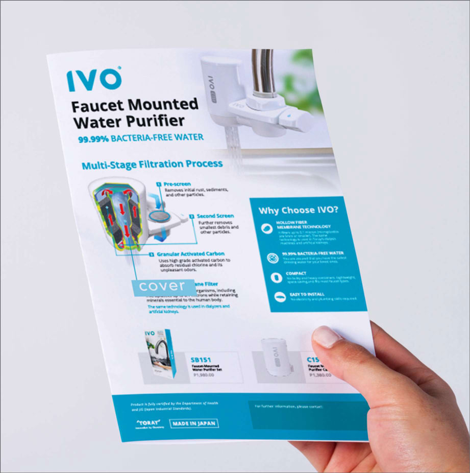
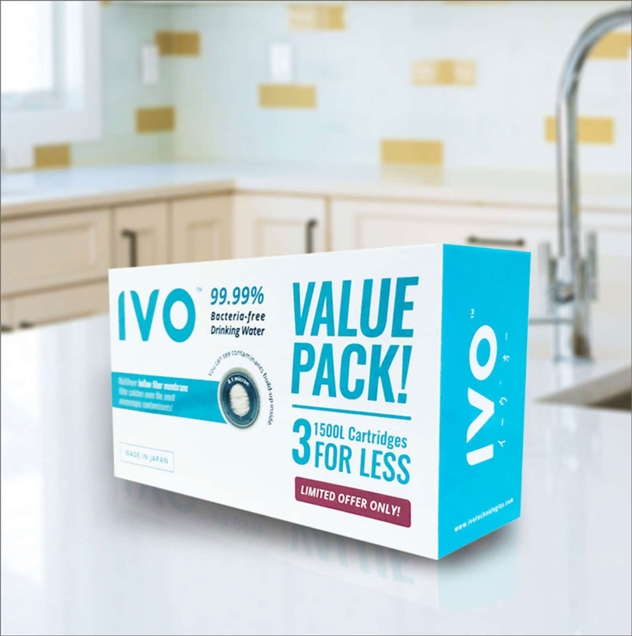
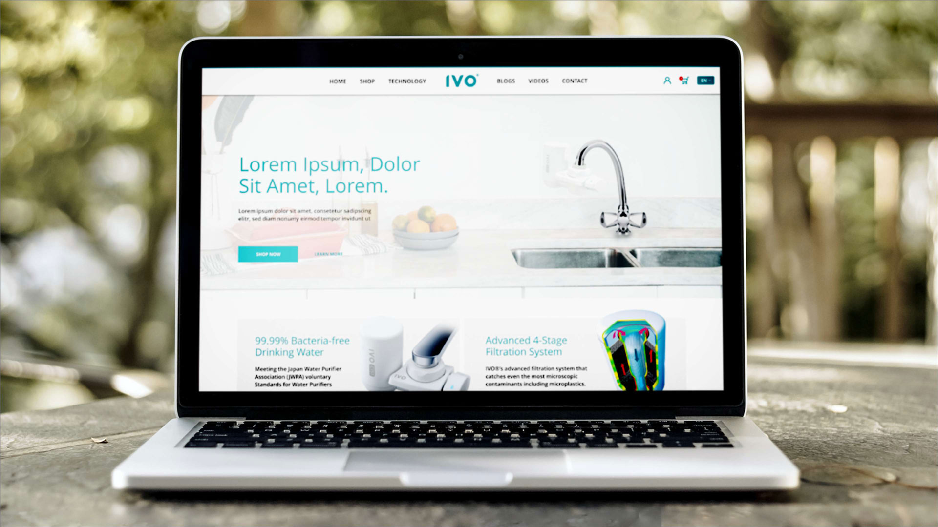
Turning innovation into an essential
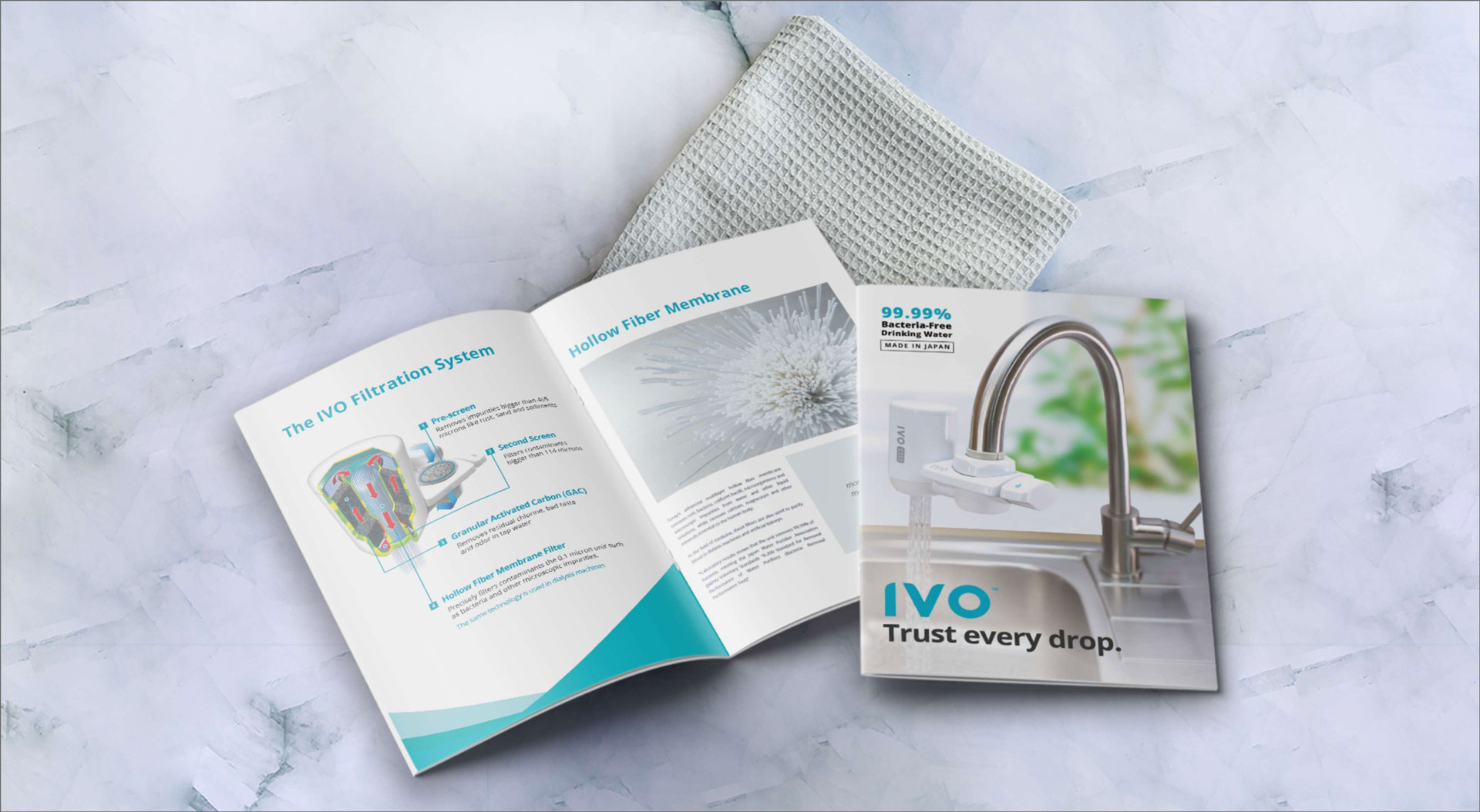
To replicate Torayvino’s success in a new market is to position IVO as a reliable yet easily accessible product. We created a brand identity that made IVO look innovative, credible, and incredibly easy to use. We emphasized its one-of-a-kind technology with the guise of a friendly household product, effectively making it a staple for faucets everywhere.


