Personal Collection is one of the biggest direct selling companies in the Philippines, with over hundreds of thousands of dealers across the country. They are dedicated to transforming the lives of Filipinos with sustainable products and life-changing opportunities that show care for every Filipino home and the world we live in.
The company was born from a compassion to better the lives of Filipinos, and was grown through the commitment of thousands of hardworking people striving to make an impact. With people as their foundation, they make it a priority to serve the best interests of their customers and dealers in every way they can. However, their previous website needed improvements in design, speed, and functionality, which was not the impression they hoped to provide.
Translating their brand of service to user experience,
Sunday Studio was up to the task to revamp their website.
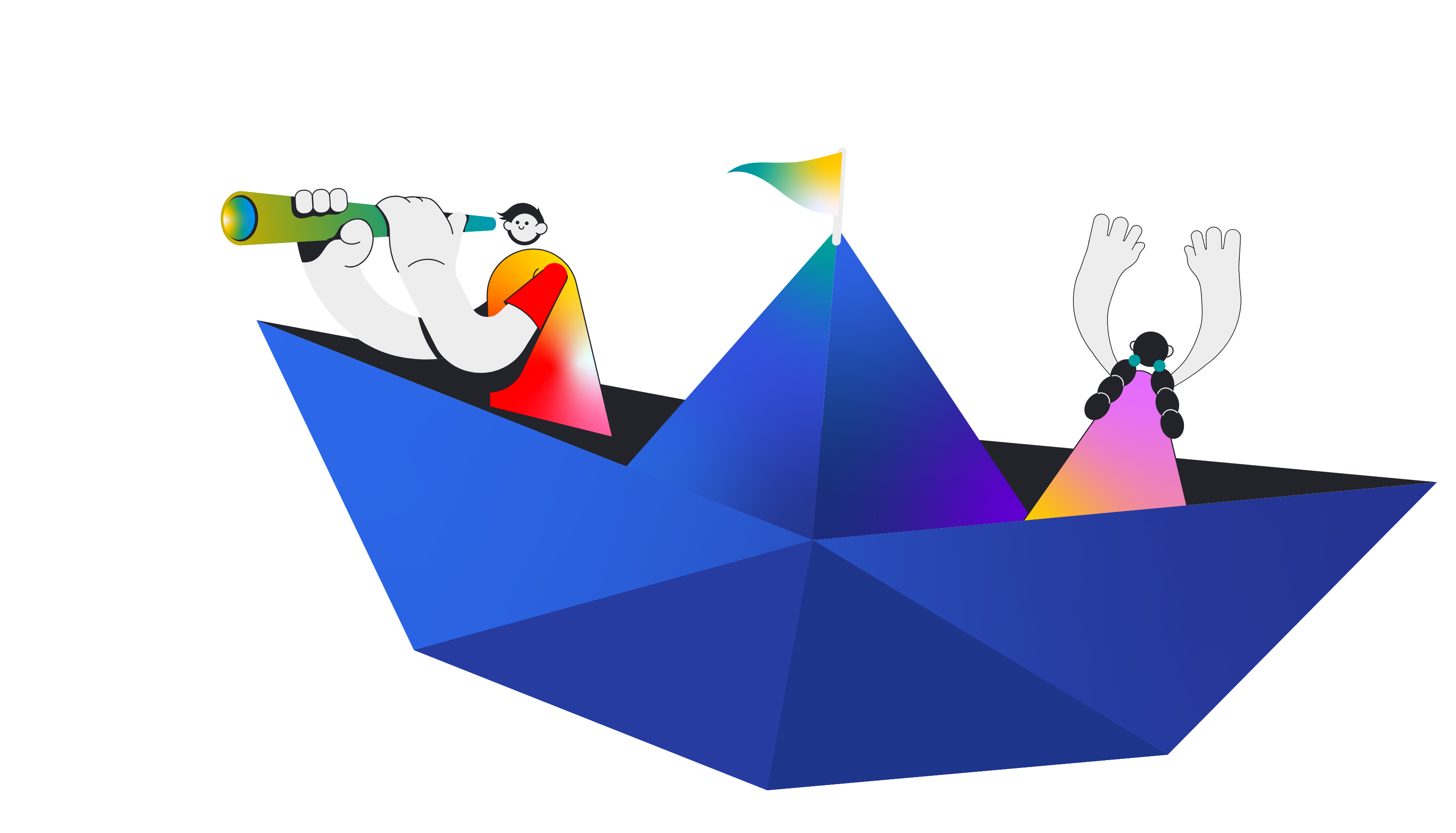
We updated the website with a design and experience that puts the user as the hero of the story. Since Personal Collection was founded on the idea of a better world, we wanted the website to depict a journey where users can freely explore and discover the story behind the brand and what it aims to do. This led us to create a simple yet creative visual language that helps users navigate within the site in a way that is fun, friendly, and functional.
Making a website of this scale was a challenge for the team, but the project's complexity proved to be an exciting problem to solve. We planned our steps for every milestone to visualize the possible routes.
Jilian Bandelaria, Senior Accounts Manager
The client initially wanted to incorporate a fish-eye look for the site to emulate their vision of a “PC” World. However, it did not offer a comfortable user experience, which is why we opted to use isometric design for its smoother implementation. Along with dynamic animations, we displayed hero images and objects that narrate the context of each pages. Their angled appearance brought a perception and depth that provided users with better visualization, making every detail and direction easy to follow. We also took a minimalistic approach in the layout by using simple and recognizable design elements that feature clean lines and flat colors. The white space created a sense of visual hierarchy while the vibrant yet subdued color palette, paired with a sans serif typeface, allowed us to add more appeal and personality to the website without losing the clarity of the imagery.
Creating the visuals was about finding the right balance between creativity and usability. We wanted to be creative in telling a story while making the flow simple and straightforward enough for every user.
Anne Manuela, Art Director
To ensure the consistency of our communication with the visuals, we also introduced a new brand voice and messaging that aligns their care and compassion for their customers and dealers with their concern to local communities and the environment. From the navigation to call-to-action buttons, we were clear and concise about our intent— to guide users to the world of PC and engage them in our story.
Since Personal Collection is built around people, we want users to be the center of the story. We expressed ourselves in first-person so they can share our point of view and find their position in our journey.
Mark Young, Content Lead
As we finalize the website design and content, the feasibility of the website suggested another challenge for us in terms of development. The team worked closely through a lot of trial and error on how to go about developing the site. Since we still needed to familiarize ourselves with the new features and hosting environment, it was helpful that the client and their IT team were also open to our recommendations on how we can make the best UX possible. This way, we were able to adjust our assets accordingly and make appropriate changes to the design implementations.
Our close collaboration with the team and our clients helped us work through the blockers and technical issues during the development phase. Their unified inputs contributed to making the website more feasible.
Jayar Daquis, Web Developer
After organizing a series of user tests under different scenarios, the website was finally launched and optimized for desktop and mobile devices. The website now highlights an intuitive user experience, responsive interface, faster-loading speed, cohesive design system and a well-defined content architecture, which makes the users’ journey and interaction with Personal Collection more seamless and fitting to its promise of Great Life. You can check out their website here.
©2026 Sunday studio

