Snack Time
Taking snack time to a cinematic level
Challenge
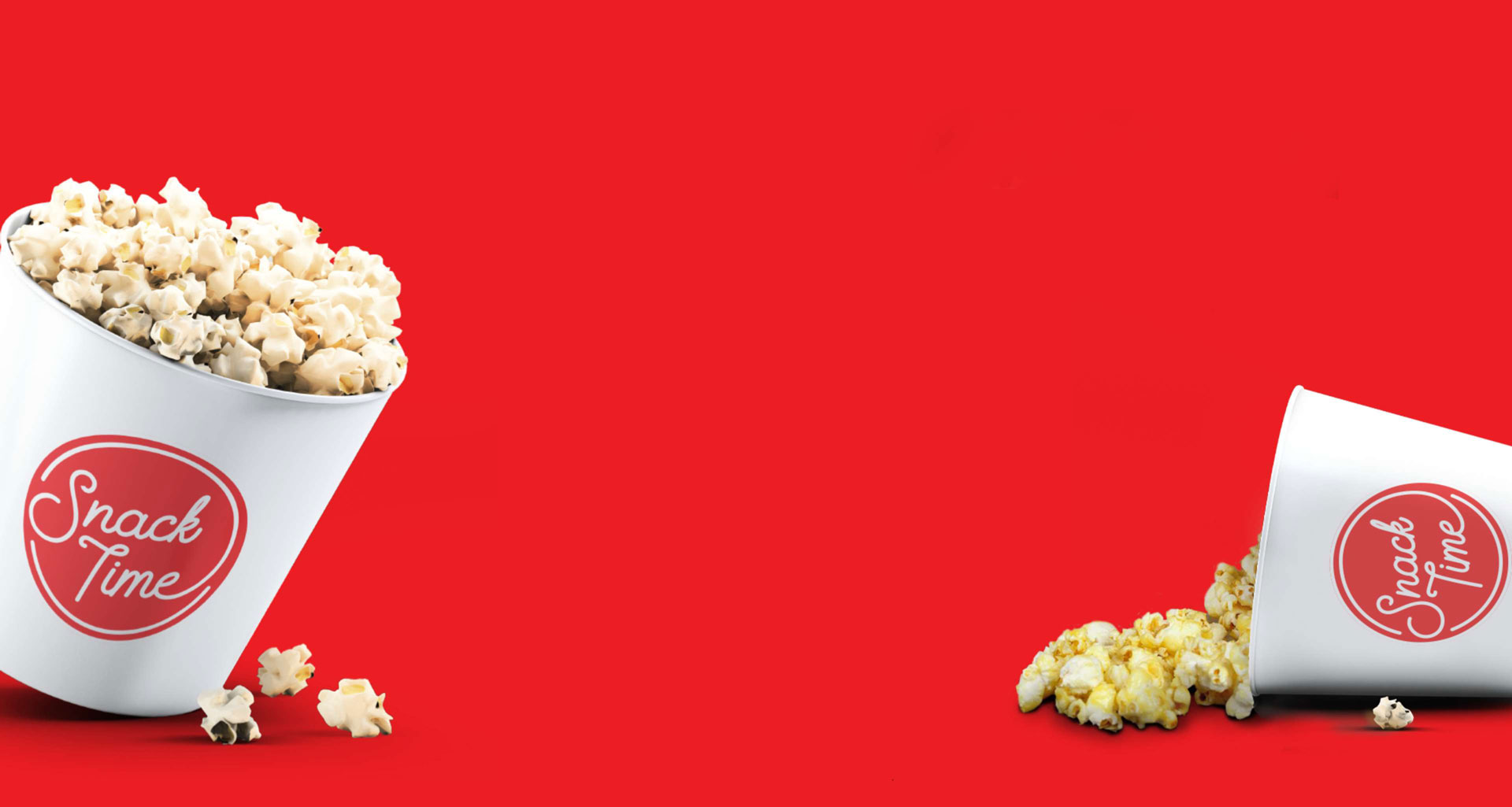
The clients wanted SnackTime to be a must-grab for every SM Cinema moviegoers. Because of this, we were tasked to refresh its identity to make the packaging visually appealing to all ages and go perfectly with their snack bar’s crowd favorites.
Client
SM Supermalls
Scope
Branding

Giving your classic snack an iconic look
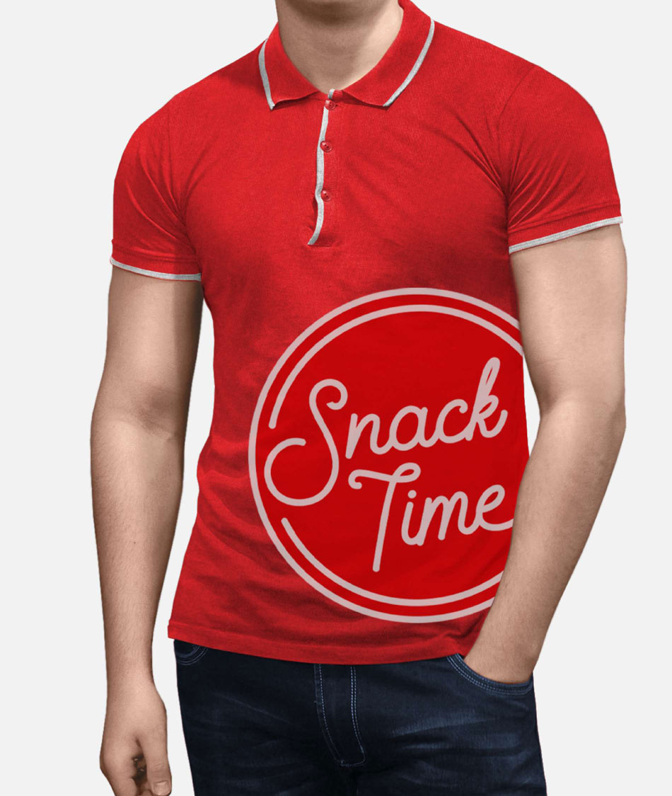
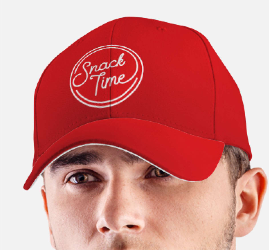
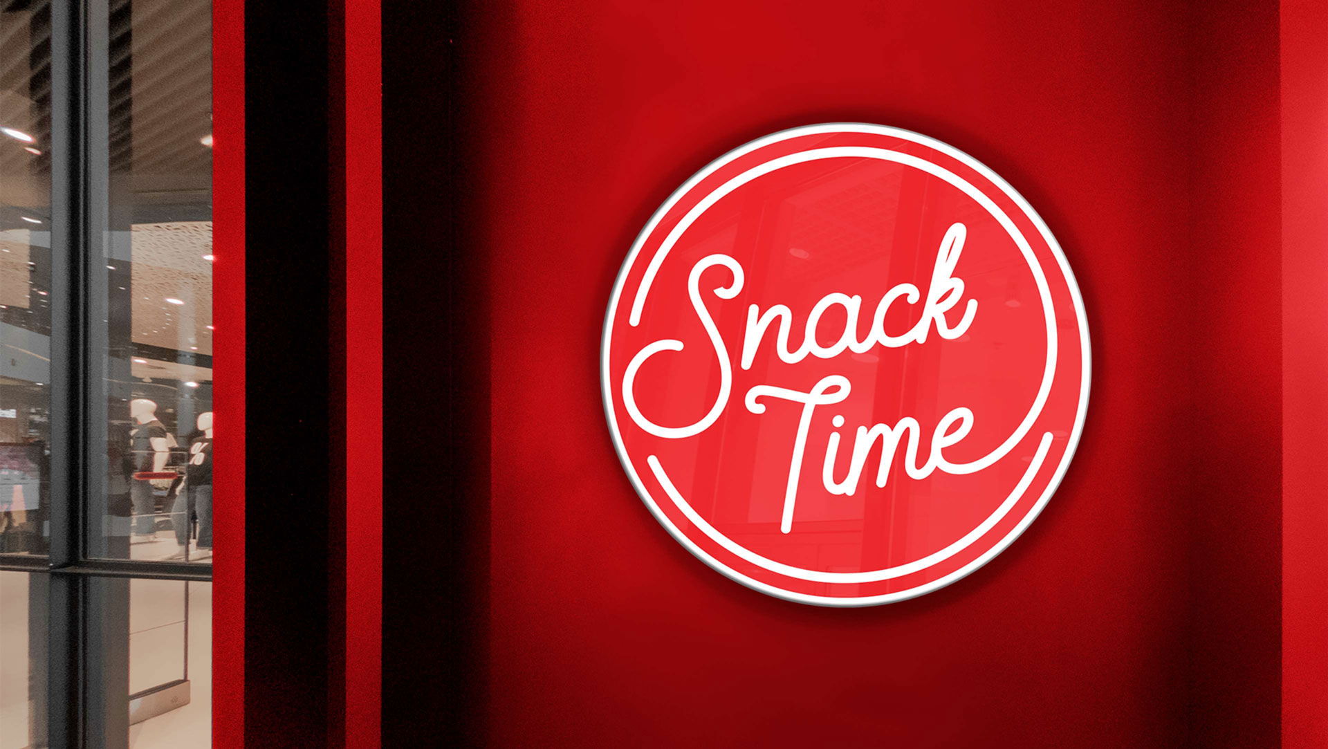
The logo takes inspiration from the marquee neon signs that we’re popularly used in retro diners and movie theaters decades ago. They have always been a trademark for pop culture and entertainment, which spells excitement and nostalgia.

Freshly popping with your favorite flavors
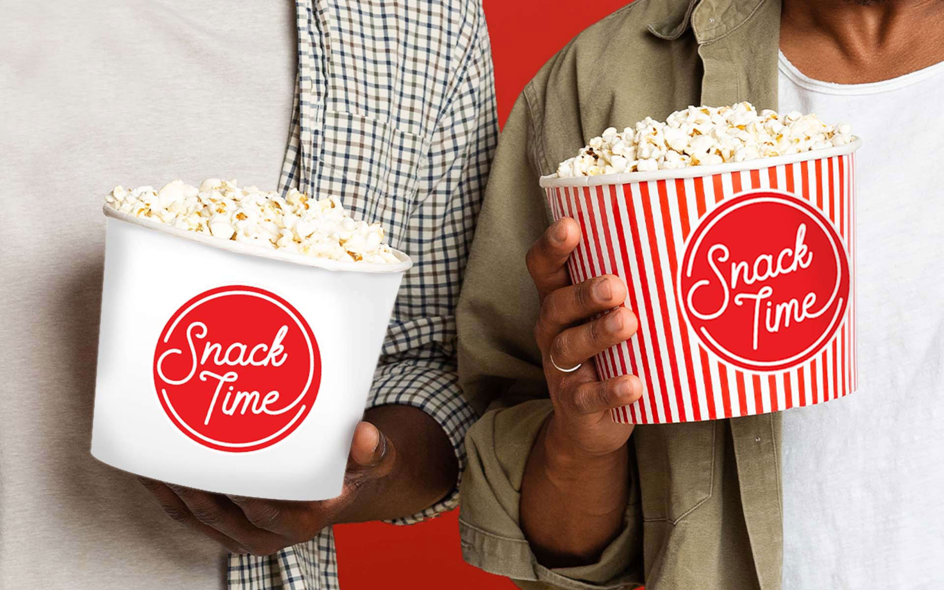
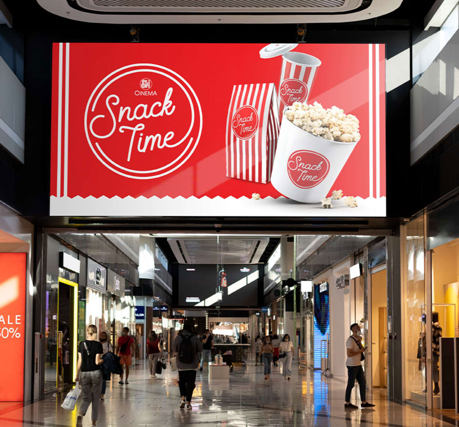
A throwback from the classic, we designed a packaging that makes use of the traditional and iconic red and white stripes, to entice every moviegoers appetite towards the old-fashioned goodness that freshly pops out from their blockbuster treats.
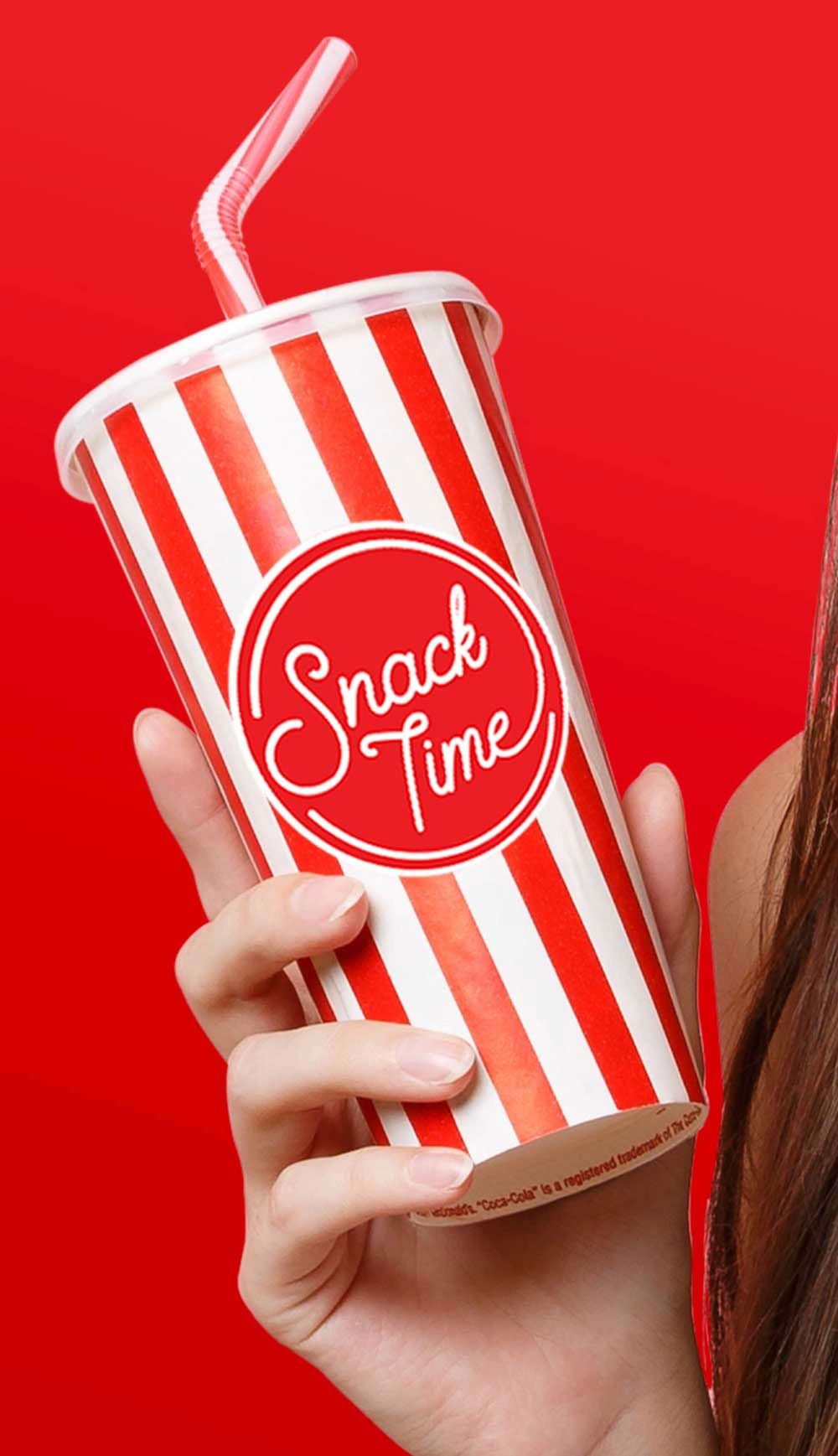
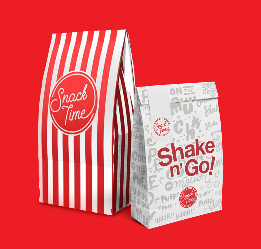
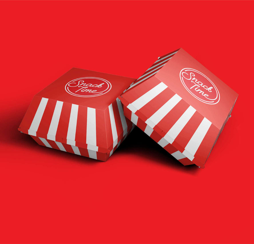
Upgrading your movie snacking experience
We explored different iterations for SnackTime’s packaging. From type-heavy and playful illustrations to minimalist designs, we tried to find a way for people to enjoy cult classics, hollywood hits, and indie gems, among others, while having their fill of good food.
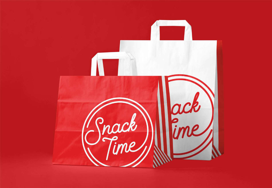
Satisfy your silver screen cravings with SnackTime
What started as a brand refresh resulted in an overhaul. We came up with a widely recognized identity that takes moviegoers back to the classic times. Still pure cinema, but this time, giving everyone more to crave for on their next screening visits.

